Radio buttons

Summary
  • Found from:
    • Forms (exclusive choice group).
    • Lists.
    • Pop-up lists.
  • Exclusive choices.
  • Requires at least 2 options.
  • One option is always selected.
  • If 'no option' could be selected, add one option with "No selection".
  • Current selection is shown by the filled radio button.
  • Selection is taken immediately in choiceGroup; the radio button group collapses and pop-up list closes.
  • In list view an action for confirming the selection is needed.
Java Related design guidelines

ChoiceGroup  
Figure 1. Radio button group (popup choice group) in Forms, collapsed and expanded
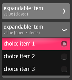
  • Select one value from a predefined list.
  • Mandatory to always select one item.
  • In case it is possible to have "no selection", add this as an item to the list.
  • The form field expands to show possible values once the field is tapped by user. 
  • When not expanded:
    • Only the parent item is shown.
    • Contains a heading line, a value line, and an arrow pointing to the right.
  • When expanded:
    • The sub-items are shown below the title and value line.
    • Radio button indicates the currently active value.
    • The arrow points downwards.
    • User can change the value by tapping on the desired item. This collapses the list, and the new value is displayed under the heading line.
    • Tapping again on the title/status line or on any other items in the form will collapse the list without making a change.
  • Instead of expanding, the MIDlet could open a list instead (see below: List).

Fixed form items  
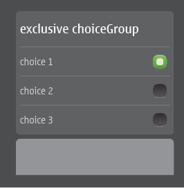
Figure 2. Radio button group (exclusive choice groups) in Forms, fixed (non-expandable)
  • Select one value from a predefined list.
  • Mandatory to select always one item.
  • In case it is possible to have "no selection", add this as an item to the list.
  • Contains:
    • Title.
    • List items with radio button/radio button place holder.
  • Form item does not collapse.
  • Editing is done inline.
  • Does not open a new view.

List  
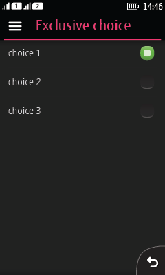
Figure 3. Radio button group list
  • A list can have radio buttons.
  • One item must be selected.
  • Select the item by tapping on the item.
  • The selection is confirmed by 'Ok' screen command (placed in Options list).
    • List view does not support placing an icon command to Action 1.
  • To cancel, user taps Back (the selection is not saved; see Backstepping for more information).

Pop-up list  
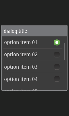
Figure 4. Pop-up list with dialog title
  • Created by specifying a dialog title to the popup list API.
  • No cancel button.
  • Tapping outside the pop-up cancels the pop-up.
  • Tapping one item selectes the item and closes the popup.
  • Always one item selected; if necessary, add "no selection" as an item.
  • Pop-up list is available for Form and Canvas.

Pop-up list, nested  
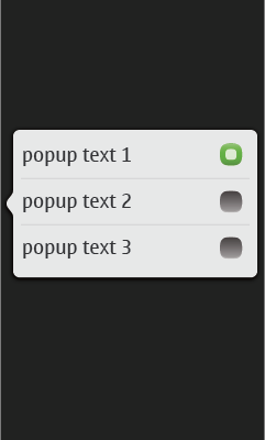
Figure 5. Nested Pop-up list without dialog title
  • Created by not specifying a dialog title to the popup list API.
  • Tapping outside the pop-up dismisses the pop-up.
  • The “tail” of the popup should point to the item it was opened from.
  • Always one item selected, if necessary add "no selection" as an item.
  • Tapping an item selects the item and closes the list.
  • Pop-up list available for Form and Canvas.